
★★★★½ 4.5/5 — A design-and-delivery stack: plan the story on paper, cut the slide to a glance, then speak.
Best for: Knowledge workers whose decks still read like documents, and who lose the room the moment people start reading.
Reading time: ~7 hrs (guide: 14 min)
Difficulty to apply: Easy to cut one deck tonight; honest on rehearsing without slides and leaving empty space alone.
Presentation Zen in one minute
Most talks fail because the slide is doing the talking. Garr Reynolds’s Presentation Zen (New Riders, third edition 2019) is the case for treating a deck as a glance, not a script: plan analog, design with restraint, and deliver as a conversation. If you take one move from this Presentation Zen summary, pick one live deck, cut it to one idea per slide, and rehearse the talk once with the laptop closed.
Key takeaways
- Plan analog first: Paper before PowerPoint. Software too early locks you into bullet theater.
- One sticky idea: If the room can only keep one sentence, write that sentence before you open a theme.
- Kill the slideument: A document projected on the wall is not a presentation. People read. You lose.
- Restraint is the skill: Cut until one idea remains. Extra slides are not extra signal.
- Empty space is a tool: Let the eye rest. Clutter is not “thorough.” It is competition for attention.
- Pictures beat paragraphs: A visual plus a few words. The sentences live in your mouth.
- You are the show: Slides support. If the talk dies when the projector dies, rewrite it.
- Naturalness over decoration: Design that looks inevitable. Templates that shout are still noise.
- Rehearse off-slide: Walk the story without clicking. Then put the glance back in.
What is Presentation Zen about?
Presentation Zen is Garr Reynolds’s playbook for talks that people can follow: prepare the story away from the software, design slides as glanceable visuals with empty space, and deliver as a conversation so the speaker — not a wall of bullets — carries the idea.
About the author
Garr Reynolds is a presentation designer and speaker who spent years inside Apple’s user-group world, then built a second career teaching people to stop putting documents on the wall. He lives in Japan, teaches at Kansai Gaidai University near Osaka, and writes at presentationzen.com. The through-line is restraint: plan the story on paper, design with empty space, and treat delivery as a conversation. Presentation Zen is the flagship. Companion titles go deeper on visuals and stage presence. He is asking you to make the slide a glance, then do the talking yourself. Explore all Garr Reynolds book summaries →
Key concepts at a glance
| Concept | What it means | Use it when |
|---|---|---|
| Prepare analog | Plan on paper before software | You open the theme first |
| Sticky idea | One sentence the room keeps | The talk has ten “main” points |
| Slideument | A document projected as a talk | People read instead of listen |
| Restraint | Cut until one idea remains | Every fact feels mandatory |
| Simplicity / empty space | Let the eye rest and land | The slide looks “full” and busy |
| Naturalness | Design that looks inevitable | Templates and clip-art shout |
| Picture superiority | A visual beats a paragraph | You are pasting speaker notes on-slide |
| You are the show | Slides support; you speak | The talk dies if the projector dies |
Part 1 — Prepare analog: the story before the software
Reynolds starts where most professionals skip: away from the laptop. Open the slide software too early and the tool starts writing the talk — title, bullets, another title, another six lines. That is not preparation. That is typesetting a memo you will later read aloud. Analog planning means paper, sticky notes, a whiteboard: what is the one idea, who is in the room, what should they be able to say in the hallway after. The software comes last, as a camera for a story you already hold.
He wants a structure you could tell at dinner. Hook, body, close. Not a dump of every fact you researched. If the room can only keep one sentence, write that sentence before you pick a theme. Reynolds’s practical test is cruel and useful: if you cannot say the point without clicking, you do not have a talk yet. You have a document.
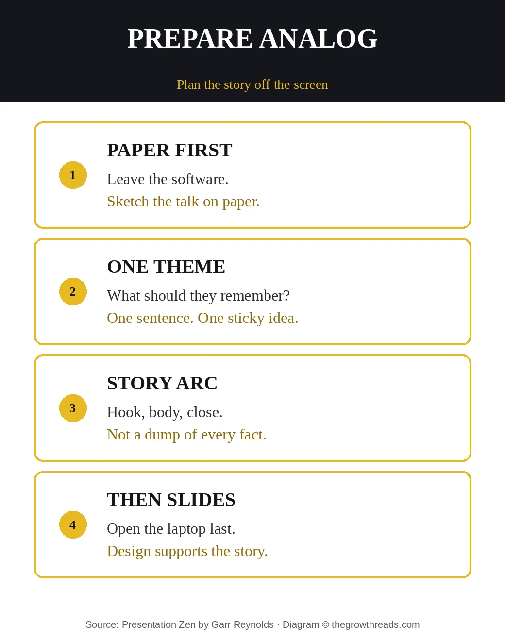
For a knowledge worker the drill is small. Tonight, take the deck you actually have to give. Close the file. On one page write: the audience, the one sentence they should keep, and three beats that earn it. If you cannot fill that page, the live deck is not a talk. It is a handout. Put the handout in a PDF. Put the glance on the wall.
TGR Note: Talk Like TED is Carmine Gallo on the 18-minute story, emotion, and novelty. The Presentation Secrets of Steve Jobs is Gallo on theatrical staging — headline, demo, encore. Use Gallo when the stall is story shape or keynote craft. Use Reynolds when the stall is the wall of bullets: you already have a story, and the slides are still a document.
Part 2 — Design with restraint, not decoration
The middle of the book is design as subtraction. Reynolds names three keys that sound like a poster and work like a filter: restraint, simplicity, naturalness. Restraint is the willingness to cut until one idea remains on the slide. Simplicity is empty space used on purpose — not a sparse accident, a place for the eye to land. Naturalness is design that looks inevitable: type you can read from the back, images that belong, no clip-art noise, no template that is louder than the point.
You do not have to become a designer to use the filter. Ask of every slide: can they glance it in two seconds and look back at you? If they have to read, you have handed the room a document and asked them to listen at the same time. They will pick reading. The extra facts you were afraid to omit can live in a leave-behind. They do not need to live at 18-point on a dark rectangle.
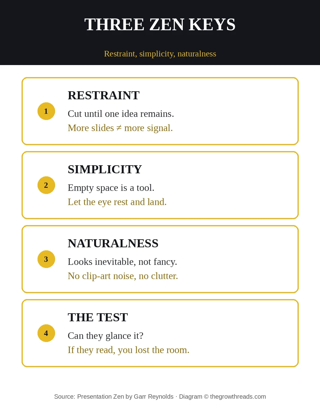
Make it physical. Pick six slides from last week’s deck. For each, keep one idea, one visual or a handful of words, and delete the rest. If a slide still needs a paragraph, it is a handout page. Reynolds’s picture-superiority instinct is the same job: a photograph or a simple diagram plus a short label will be remembered after the bullets are gone. The sentences stay in your mouth, where they can change with the room.
TGR Note: Made to Stick is Chip and Dan Heath on why an idea survives: simple, unexpected, concrete. Use the Heaths when the stall is the idea itself — it is not sticky yet. Use Reynolds when the idea is already sticky and the slides are burying it. Simplicity here is visual, not just verbal. Both books are arguing for less, aimed at different layers of the same talk.
Part 3 — Kill the slideument
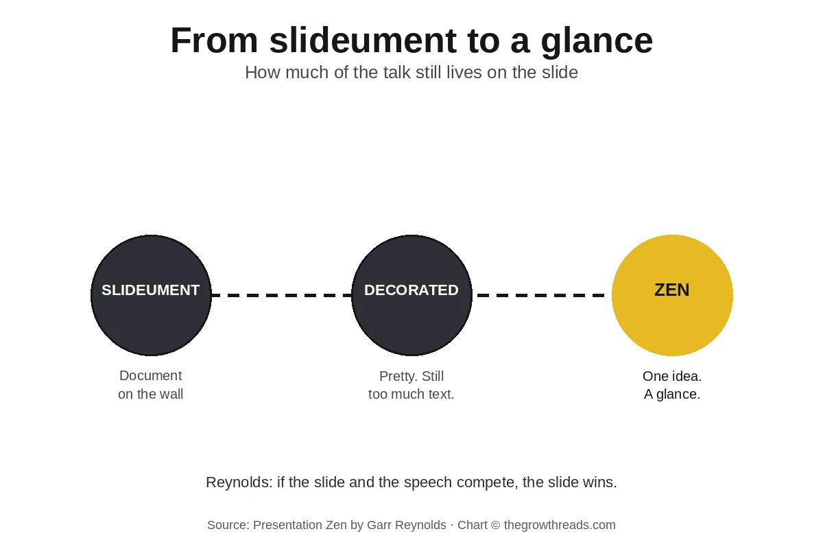
Reynolds’s most useful insult is “slideument”: a document you project and then read. It feels professional because it looks complete. It fails because the audience cannot read and listen at once. The moment the paragraph appears, you have two talks in the room — yours and the wall’s — and the wall usually wins. The fix is not a prettier template. The fix is to split the jobs. The slide is a glance. The handout is the document. The speaker is the argument.
That split is the book’s signature move. A glanceable slide can be almost empty: one photo, one number, five words. It looks “unfinished” to people trained on six-bullet corporate templates. It is finished when it supports a sentence you can say without looking. If the slide and the speech compete, Reynolds’s rule of thumb is that the slide wins — so stop competing. Put less on the wall.
This is where TED Talks later made the same point from the curator’s chair: the talk is a gift you can carry, not a file you can hide behind. Presentation Zen is how to stop hiding. Take one live meeting this week. Duplicate the deck. Version A is the document — send it ahead. Version B is six glances. Present B. Watch where eyes go. If they stay on you, the cut worked.
TGR Note: TED Talks is Chris Anderson on the idea as a gift and the through-line you can walk. Use Anderson when you need courage to make the talk about one idea. Use Reynolds when you already have the idea and the slides are still a memo. They rhyme. They are not the same book. If you only change the template and never split glance from handout, you have used neither.
Part 4 — You are the show
The last movement is delivery. Reynolds wants presence: you are the show, the slides are support. Rehearse without clicking. If the story dies when the projector dies, rewrite it until it can stand in a hallway. On stage, let a slide breathe. A pause is a design choice, not dead air. Look at people, not at your own bullets. The glance on the wall should be simple enough that you never have to read it.
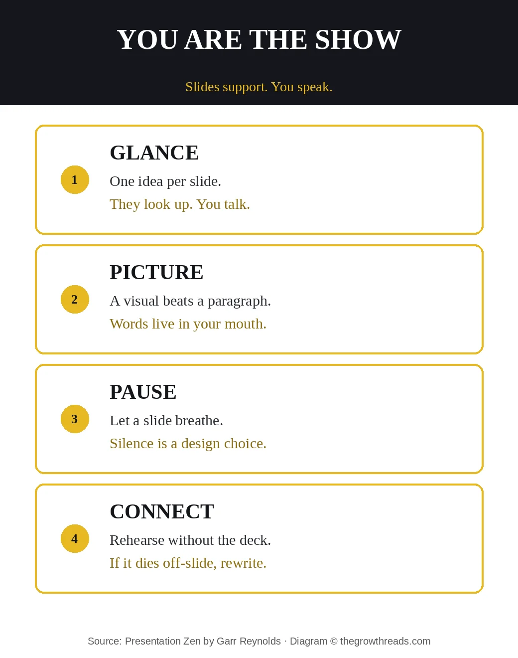
He also argues for a kind of naturalness in the room that matches the design: no reading, no racing, no hiding behind a lectern of notes that already exist on-slide. The 2008 examples in earlier editions are dated; the ratio is not. A talk that can survive a failed dongle is a talk. A talk that is the file is a meeting you could have emailed.
Make a card: one sentence the room should keep, six glances, one PDF handout, one rehearsal with the laptop closed. That is Presentation Zen without the seminar. The Practice will hold you when you wait to feel ready to ship the talk. Gallo will hold you when you need theatrical shape. Reynolds would still start by closing the software tonight.
TGR Note: Rework is Fried and Hansson on doing less so the work can be seen. Use Rework when the stall is a company that documents everything and ships a meeting. Use Reynolds when the stall is the meeting itself: the slides are the document. Both are arguing that completeness on the page is not the same as a result in the room.
Who is Presentation Zen best for — and who should read something else first?
Best for professionals who already present every week and still watch the room read. Especially useful if your decks are thorough, your meetings are long, and you can feel the moment people stop listening because they started scanning.
Read something else first if you need story shape before design — start with Talk Like TED or The Presentation Secrets of Steve Jobs, then come back to cut the slides. If the idea itself is not sticky yet, start with Made to Stick. If you need permission to make the talk about one idea, use TED Talks. Come to this book when the bottleneck is the wall, not a missing plot.
Questions to reflect on
- Which live deck is actually a document you are asking people to read while you talk?
- If the room could keep only one sentence, what would it be — written tonight, not “in the deck”?
- Which slide would still make sense as a glance from the back row?
- What would you send as a PDF so the slides can stop being the handout?
- Can you walk the talk once with the laptop closed, and where does it die?
🔥 Ready to kill one slideument this week?
Pick one live deck, cut it to one idea per slide, and rehearse once with the laptop closed.
How to apply Presentation Zen (7-day plan)
- Day 1 — Close the file. On paper: audience, one sticky sentence, three beats. Do not open the software yet.
- Day 2 — Split the jobs. Duplicate last week’s deck. Mark document pages vs glance pages. The document becomes a PDF.
- Day 3 — One idea each. Rebuild six slides so each carries one idea. Delete the rest or move it to the handout.
- Day 4 — Pictures. Replace two paragraph slides with one image or one number plus a short label.
- Day 5 — Empty space. Cut about a third of the ink on the remaining slides. If it looks “unfinished,” you are close.
- Day 6 — Laptop closed. Walk the talk once with no slides. Circle the places you needed the wall to remember for you. Rewrite those.
- Day 7 — Present the glance. Use the short deck in a real meeting. Send the PDF ahead. Watch whether eyes stay on you.
Frequently asked questions
What is Presentation Zen about?
Presentation Zen is Garr Reynolds’s playbook for talks people can follow. He argues that most decks fail because they are documents on the wall — slideuments — and that the fix is to plan the story on paper, design each slide as a glance with empty space, and deliver as a conversation. The usable residue is not a prettier template. It is one sticky sentence, a short glanceable deck, a PDF handout for the details, and a rehearsal with the laptop closed. It is the design-and-delivery book underneath Talk Like TED and the Jobs keynote manuals.
What is a slideument in Presentation Zen?
A slideument is a document you project and then read: paragraphs, six bullets, a logo, a page number, and a speaker who is competing with the wall. Reynolds’s point is that people cannot read and listen well at the same time, so the wall usually wins. The TGR application is to split the jobs. Send the document as a PDF. Put one idea on the slide. Speak the argument. If a slide still needs a paragraph, it is not a slide. It is a handout page you are asking the room to study during your talk.
Is Presentation Zen worth reading if I already read Talk Like TED?
Yes if your story shape is fine and the slides are still a memo. Talk Like TED is Gallo on emotion, novelty, and the 18-minute arc. Presentation Secrets of Steve Jobs is Gallo on theatrical headlines. Presentation Zen is Reynolds on the wall: restraint, empty space, pictures, and a speaker who can survive a dead projector. If Gallo already got you to tell a story, this book is useful when the room still reads instead of listening. Skip it as a first presentation book if you do not yet have a point; start with Made to Stick or TED Talks, then come back to cut the deck.
How is Presentation Zen different from Made to Stick?
Made to Stick is Chip and Dan Heath on why an idea survives: simple, unexpected, concrete, credible, emotional, stories. Presentation Zen takes a sticky idea and stops the slides from burying it. The Heaths work on the message. Reynolds works on the glance and the delivery. Use Made to Stick when the stall is the idea itself. Use Reynolds when the idea is already clear and the deck is still a document. They rhyme. They are not the same book. If you only change the template and never write the one sentence, you have used neither.
Who should read Presentation Zen?
Professionals who present every week and still watch people read the wall — especially anyone whose decks are thorough, complete, and impossible to glance. It is useful if you have outgrown “add a nicer theme” and need permission to split the handout from the talk. Skip it as a first book if you need story craft more than design; go to Talk Like TED or TED Talks, then return. Come here when the bottleneck is the slideument: you have a point, you have a file, and the file is doing the talking.
How long is Presentation Zen and how should I read it?
The New Riders third edition runs about 336 pages; most readers need six to eight hours. Do not collect every Japanese-aesthetic chapter as a poster. Read for three jobs: plan one talk on paper, rebuild six slides as glances, and rehearse once with the laptop closed. Then run one of them in a real meeting the same week. If you highlight restraint and never cut a live deck, you have bought a design magazine. If you land a sticky sentence, a short deck, and a PDF handout by Friday, you have used the book.
Does Presentation Zen mean my slides should have almost no words?
Almost no words on the wall, not almost no words in the talk. Reynolds wants the sentences in your mouth and a glance on the slide — a photo, a number, a short label — so the room can look at you. Detailed proof, tables, and legal language belong in a handout you send. Some rooms still need a few words on-slide for hybrid calls and recordings; keep those words huge and few. The test is unchanged: if they have to read a paragraph, you have handed them a document. Cut until they can glance and look up.
Related summaries
- Talk Like TED — 18 minutes, emotion, a story that travels
- The Presentation Secrets of Steve Jobs — headline, demo, encore
- TED Talks — treat the idea as a gift
- Made to Stick — make the idea survive the hallway
- More on the best productivity books pillar
How we analyze books: we read for application, not for a takedown — then we add a plan you can run this week. Read our full methodology.